Demo: Stunning data visualization in the AlloSphere
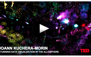
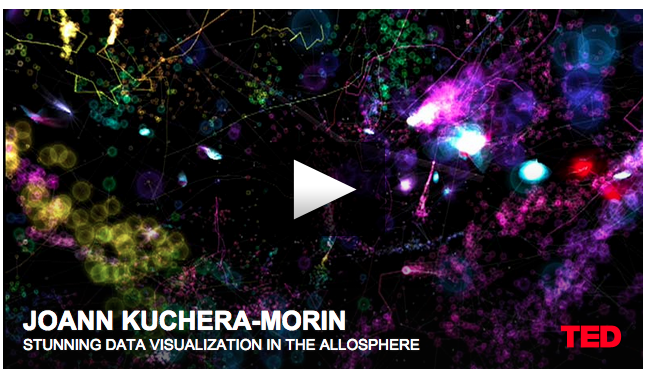
An entirely different level of data visualization-- based on real-time data-- brain fMRI data yields a fully interactive model!

An entirely different level of data visualization-- based on real-time data-- brain fMRI data yields a fully interactive model!
The tech website Gizmodo recently posted an article that displays the data for the most popular photos of the year. It examines what cameras they were shot with and the settings that were used to shoot them. Unfortunately, this is a classic example of interesting data that was displayed poorly. An example: […]
Information graphics, or infographics, have been around awhile. (Cave paintings, anyone?) In fact, they’ve become so integrated into daily life that we often don’t notice them or think of them as such. What you may have noticed, however, is the recent uptick in slickly designed infographics popping up in social media, by politicians, and even in college football. Often, they’re used in an attempt to distill huge amounts of data involving complex issues into bite-sized nuggets of information. Sometimes they’re successful (see one of our favorites here) – and other times, not so much. What makes the difference between infographics that work and those that just… don’t? We’ll cover that in an upcoming post. For now, let’s go into what an infographic is, how you can use it, and compare the infographic to its cousin, the data visualization. […]


